How to Create Line Graphs in Google Sheets – A Guide

Learn how Google Sheets line graphs reveal trends in your sales, marketing, and ops data, then see how an AI computer agent can build them for you.
Advanced computer use agent
Production-grade reliability
Transparent Execution

Why Google Sheets + AI

Every growth story has a spreadsheet behind it. In Google Sheets, a simple line graph can turn thousands of dry cells into a timeline of your business: revenue creeping up after a new campaign, churn dipping after a pricing change, leads spiking after a webinar. Once you know how to format your data, insert a chart, and choose the right line style, you can spot trends, seasonality, and outliers in seconds instead of staring at tables for hours.But the real unlock is when you stop building those charts by hand. An AI computer agent can open Google Sheets, clean and structure your data, insert the right line chart, label axes, apply your brand colors, and share the file with your team—on a schedule or on demand. Instead of recreating the same report every week, you delegate the workflow once and get consistent, auditably-built graphs forever.

How to Create Line Graphs in Google Sheets – A Guide

### Why Line Graphs in Google Sheets MatterIf you run a business, agency, or marketing team, your numbers already live in Google Sheets: traffic, leads, MRR, ad spend, signups. A line graph is the quickest way to turn that chaos into a story—showing where you’re accelerating, plateauing, or leaking.You can absolutely build these charts manually. But when you’re updating the same dashboards every day, week, or month, the work becomes copy‑paste theatre. That’s where an AI agent like Simular steps in: it performs the same clicks you do, across desktop and browser, but tirelessly and transparently.Below are the top ways to create line graphs in Google Sheets—first manually, then at scale with an AI computer agent.---## 1. Manual Method: Build a Basic Line Graph**
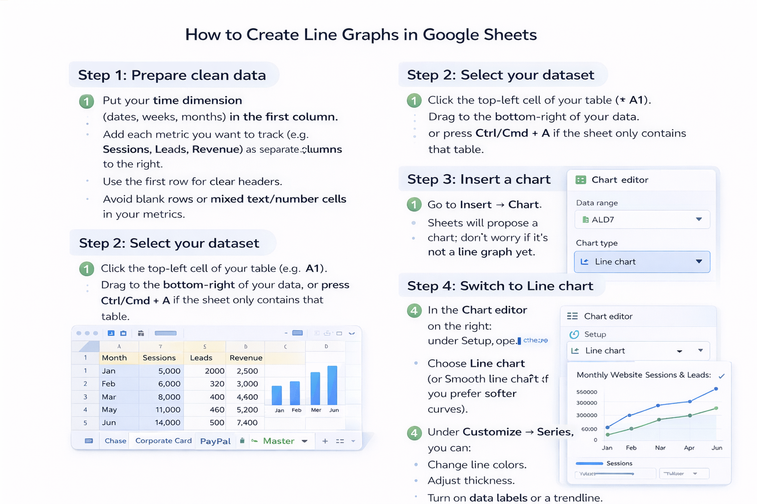
Step 1: Prepare clean data**- Put your time dimension (dates, weeks, months) in the **first column**.- Add each metric you want to track (e.g., Sessions, Leads, Revenue) as separate **columns to the right**.- Use the **first row** for clear headers.- Avoid blank rows or mixed text/number cells in your metrics.**Step 2: Select your dataset**- Click the top‑left cell of your table (e.g., A1).- Drag to the bottom‑right of your data, or press **Ctrl/Cmd + A** if the sheet only contains that table.**Step 3: Insert a chart**- Go to **Insert → Chart**.- Sheets will propose a chart; don’t worry if it’s not a line graph yet.**Step 4: Switch to Line chart**- In the **Chart editor** on the right, under **Setup**, open **Chart type**.- Choose **Line chart** (or **Smooth line chart** if you prefer softer curves).- Confirm that your date column is on the horizontal axis and your metrics are on the vertical axis.**Step 5: Customize for clarity**- Go to **Customize → Chart & axis titles** to: - Rename the chart (e.g., “Monthly Website Sessions & Leads”). - Add horizontal axis title (e.g., “Month”). - Add vertical axis title (e.g., “Count of Sessions & Leads”).- Under **Customize → Series**, you can: - Change line colors. - Adjust thickness. - Turn on data labels or a trendline.**Pros (Manual)**- Full control over every visual detail.- Great for learning how charts work.- No extra tools required.**Cons (Manual)**- Repetitive: you’ll rebuild or tweak charts every reporting cycle.- Easy to make small mistakes (wrong range, missing months, mislabeled axis).- Scales poorly if you manage many clients, products, or markets.---## 2. Semi‑Automated: Templates and Sparkline TricksIf you’re not ready for full AI agents, you can still cut time with built‑in Google Sheets features.**Option A: Reusable chart templates**- Create a “master” sheet with your favorite line chart layout.- Use **File → Make a copy** for each new campaign or client.- Swap in new data under the existing headers; the chart updates automatically.**Option B: SPARKLINE for mini trend lines**- In a blank cell, type a formula like: - `=SPARKLINE(B2:G2)` where B2:G2 is a row of monthly values.- Sheets renders a tiny line chart in a single cell—perfect for dashboards that compare many products or channels.**Pros (Semi‑Automated)**- Faster than rebuilding from scratch.- Keeps visual consistency across reports.- Zero extra tools or setup.**Cons (Semi‑Automated)**- You still do the copy‑pasting and data cleanup.- Easy to accidentally break a template by overwriting ranges.- Still not ideal if you handle dozens of Sheets.---## 3. Fully Automated: Use a Simular AI Computer AgentNow imagine this weekly scene:It’s Monday morning. Instead of opening Google Sheets, pasting exports, and fixing chart ranges, you just type: *“Update all client performance line graphs for last week and share links in our reporting channel.”* Then you watch your AI computer agent do the work.That’s what Simular Pro is built for: agents that use your desktop and browser like a teammate.**What the agent can do for line graphs**- Open your Google Sheets reports in the browser.- Import or paste new data (from CSVs, CRM, ad platforms, etc.).- Clean and format columns so dates, numbers, and headers are consistent.- Insert new line charts or update existing ones when ranges grow.- Apply your standard styling: colors, titles, legends, and axes.- Log every step so you can review and tweak the workflow.**Example: Weekly marketing report automation**1. Agent downloads the latest ad and analytics exports.2. Opens the master reporting Sheet for Client A.3. Adds last week’s numbers to the table.4. Expands the chart range to include the new rows.5. Checks that the correct metrics are on each axis.6. Renames the chart subtitle with the latest date range.7. Shares the updated Sheet link in your team’s channel.**Pros (AI Agent Automation)**- **Massive time savings** when you have many similar reports.- **Production‑grade reliability**: Simular agents are designed for workflows with thousands of steps.- **Transparent execution**: every click and keystroke is inspectable, so you’re never trusting a black box.- Can integrate via **webhooks** into your existing pipelines (e.g., run after a data refresh completes).**Cons (AI Agent Automation)**- Requires a short upfront investment to design and test the workflow.- Best suited when you have recurring tasks (daily/weekly/monthly), not one‑off charts.- You still own the logic: you decide which Sheets, metrics, and timelines matter.---## 4. When Should You Hand It Off to an Agent?If you answer “yes” to any of these, it’s time to delegate:- You recreate the same Google Sheets line graphs **every week**.- You manage **multiple clients or product lines** with similar dashboards.- Reporting prep steals time from strategy, sales, or creative work.In that world, your best move isn’t to click faster—it’s to let a Simular AI computer agent click for you, exactly the way you would, while you focus on what the chart is trying to tell you.

Scale Google Sheets Line Graphs With AI Agents Now

Train Simular agent
Define a clear playbook for your Simular AI agent: which Google Sheets to open, which ranges hold date and metric columns, and how each line graph should be styled and titled.
Test and refine agent
Run your Simular AI agent on a copy of your Google Sheets reports first. Verify data ranges, axes, and labels, then tweak its instructions until the line graphs update flawlessly.
Scale tasks to agent
Once the workflow is solid, delegate all recurring Google Sheets reporting to your Simular AI agent. It can update line graphs across clients and teams on a schedule or via webhook triggers.

FAQS