How to Build Bar Graphs in Google Sheets: A Practical Guide

Turn everyday metrics into clear bar graphs in Google Sheets and let an AI computer agent handle the repetitive clicks, formatting, and updates behind the scenes.
Advanced computer use agent
Production-grade reliability
Transparent Execution

Why Use AI in Google Sheets

If you run a business, agency, or sales team, you probably live inside Google Sheets more than you’d like to admit. Pipeline reviews, ad performance, MRR snapshots—everything lands in the same endless grid of numbers.Bar graphs are the moment that grid becomes a story. They let a client see which channel is winning, or help your team instantly spot the weak product line, without scrolling through columns.But manually building those charts every week is the digital equivalent of washing dishes: necessary, predictable, and incredibly time-consuming. Once you’ve defined what you want—“compare this month’s revenue by channel” or “show close rates by rep”—an AI computer agent can follow that recipe forever. It can open Google Sheets, clean ranges, insert bar charts, style them to your brand, and drop them into reports. That means you keep the insight and control, while the agent quietly handles the boring part on autopilot.

How to Build Bar Graphs in Google Sheets: A Practical Guide

From Messy Grid to Clean Bars

Picture a Monday morning. Your client wants a quick view of which campaigns worked last month. The data is in Google Sheets, but it’s just a wall of numbers. Turning that into a bar graph is the difference between confusion and clarity.

There are two ways to get there: doing it manually, or having an AI agent do it for you at scale. Let’s walk through both.

Manual Method 1: Simple Bar Graph (Hands-On)

Best for: One-off reports, quick checks, learning the basics.

Steps:

  1. Prepare your data
    • Column A: categories (e.g., "Channel", "Rep", "Product").
    • Column B (and C, D…): numeric values (spend, revenue, leads).
    • Make sure headers are clear and there are no random blanks.
  2. Select the data range
    • Click and drag to highlight your labels and numbers (including headers).
    • For example: A1:B7 for “Channel” and “Revenue”.
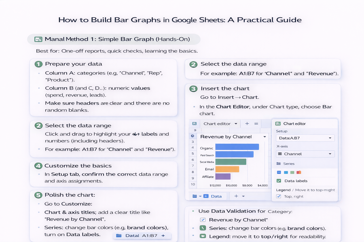
  3. Insert the chart
    • Go to Insert → Chart.
    • In the Chart Editor, under Chart type, choose Bar chart.
  4. Customize the basics
    • In the Setup tab, confirm the correct data range and axis assignments.
    • Switch rows/columns if your labels or values ended up on the wrong axis.
  5. Polish the chart
    • Go to Customize:
      • Chart & axis titles: add a clear title like "Revenue by Channel".
      • Series: change bar colors (e.g., brand colors), turn on Data labels.
      • Legend: move it to top/right for readability.

Pros (Manual):

  • Full control over every detail.
  • Great for learning how Google Sheets thinks about charts.

Cons (Manual):

  • Repetitive if you do this weekly across many tabs/clients.
  • Easy to misclick and break ranges when you’re in a rush.

Manual Method 2: Stacked or Grouped Bars

Best for: Comparing parts of a whole (stacked) or multi-series comparisons (grouped), like revenue by channel and by region.

Steps:

  1. Structure multi-series data
    • Column A: labels (e.g., Months).
    • Columns B–D: series (e.g., "North", "South", "West" revenue).
  2. Insert a bar chart (same as above) and then:
    • In the Chart Editor, choose Stacked bar chart or Clustered/Grouped bar under the bar chart options.
  3. Tune readability
    • Use distinct colors per series.
    • Add a meaningful legend and axis titles so stakeholders can read it without you explaining.

Pros:

  • Rich, story-driven charts that answer more than one question at a glance.

Cons:

  • More fragile: if your ranges shift, charts can break.
  • Time cost multiplies when you repeat this for every client, region, or product line.

Automated Method: Let an AI Agent Build the Bar Graphs

Now imagine you never again:

  • Copy-paste data ranges,
  • Click through the chart editor, or
  • Rebuild the same bar graph template every reporting cycle.

That’s where an AI computer agent running on your desktop comes in. With a platform like Simular Pro, you can create an agent that uses your computer the way you do:

  1. Define the workflow once
    • “Open this Google Sheet, duplicate last month’s tab, refresh data ranges, insert bar graphs for revenue by channel, color-code by performance, export to PDF.”
  2. Record or describe the steps
    • The agent learns which ranges to select, which chart type to choose, and how to style it.
    • Because Simular’s execution is transparent, you can inspect each action.
  3. Run it on demand or on a schedule
    • Trigger via button, cron, or webhook from your existing pipeline.
    • The agent does all the clicking, dragging, and formatting while you handle strategy.

Pros (AI Agent):

  • Massive time savings when you manage multiple sheets, clients, or product lines.
  • Consistent formatting every time—no “oops, wrong range” surprises.
  • Scales from tens to thousands of charts without burning your team out.

Cons (AI Agent):

  • Needs initial setup and a clear definition of your process.
  • You’ll still want to periodically spot-check outputs—humans stay in the loop.

When To Switch From Manual to AI

If you’re building one bar graph a month, manual is fine. Once you’re:

  • Updating dashboards weekly,
  • Reporting for many clients or regions, or
  • Rebuilding the same Google Sheets charts again and again,

that’s your signal to delegate the workflow to an AI agent. You keep ownership of the story; the agent just makes sure the bars show up perfectly, every time.

Scale Google Sheets Bar Charts With Smart AI Now

Train Simular Agent
Give your Simular AI agent a clear recipe: which Google Sheets file to open, which ranges hold your data, what bar chart style you prefer, and how often to update or rebuild it.
Test & Tune Agent
Run the Simular AI agent on a sample Google Sheets report, watch each transparent step, then tweak ranges, colors, and labels until the bar graphs render correctly on the first real run.
Auto Google Charts
Once the workflow is stable, trigger the Simular AI agent for each new Google Sheets dataset, or call it from your pipelines to auto-generate and refresh bar graphs at scale.

FAQS