Guide: How to Build Frequency Tables in Google Sheets

Learn to turn messy data into clear frequency summaries in Google Sheets while an AI computer agent quietly builds, updates, and audits your tables in the background.
Advanced computer use agent
Production-grade reliability
Transparent Execution

Why Google Sheets + AI agent

If you run a sales team, agency, or SaaS business, you live in spreadsheets. Leads, campaigns, survey responses, support tickets – they all land in Google Sheets as long, unreadable lists. A frequency table is the moment that chaos becomes signal: which channels drive most leads, which offers convert, which complaints keep repeating. Instead of scrolling through hundreds of rows, you see a compact story – categories and counts that spotlight what to double down on and what to fix.Now imagine that story updating itself. An AI computer agent watches Google Sheets the way an operations analyst would: importing fresh data, building frequency tables with COUNTIF, FREQUENCY, or pivot tables, formatting them, and flagging anomalies. Delegating this work means no more late-night spreadsheet cleanup before a client call. The agent does the repetitive clicks; you spend your time asking better questions and acting on the patterns it surfaces.

Guide: How to Build Frequency Tables in Google Sheets

### OverviewEvery business has *that* sheet: hundreds or thousands of rows of leads, orders, survey responses, or ticket logs. Hidden inside is a simple question: "What happens most often?" A frequency table in Google Sheets answers that instantly.Below are three levels of sophistication for building frequency tables:1) Hands-on, manual methods in Google Sheets.2) No-code automation tools to reduce clicking.3) Scaled, AI-agent workflows that let Simular handle the computer work for you.---## 1. Manual ways to build a frequency table in Google SheetsThese approaches are perfect when you’re still designing your analysis or working on small datasets.### Method 1: UNIQUE + COUNTIF (simple categorical analysis)
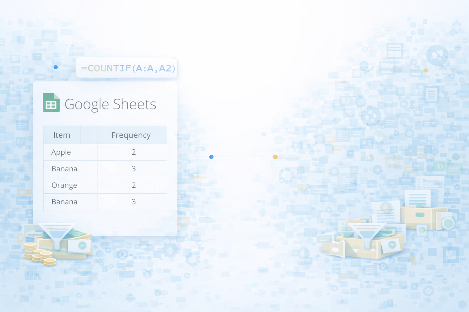
Use this when you want to know how often each category appears (e.g., lead source, campaign, rating).**Step-by-step:**1. **Prepare your data** - Put your raw values in a single column, e.g. column A with header `Rating`. - Make sure there are no completely empty rows in the middle.2. **Generate unique categories** - Click an empty cell, e.g. `B2`. - Enter: `=UNIQUE(A2:A)` - This creates a list of each unique value from column A.3. **Count each category with COUNTIF** - In `C2`, enter: `=COUNTIF($A$2:$A, B2)` - Drag the fill handle down to fill counts for all categories in column B.4. **Turn counts into a proper table** - Add headers: `Category` in B1, `Frequency` in C1. - Optionally, sort by column C (Data → Sort range) to see top values first.**Pros:** - Very transparent; easy to audit. - Works for most everyday business lists. **Cons:** - Needs manual refresh if new categories appear. - Easy to break if someone edits formulas.Official reference: COUNTIF and UNIQUE are documented in Google’s function list: [Google Docs Editors Help](https://support.google.com/docs/topic/3105474).---### Method 2: FREQUENCY for numeric dataUse this when your data is numeric (e.g., deal size, age, response time) and you want to group values into ranges or "bins".**Step-by-step:**1. **Set up your data and bins** - Put numbers in column A (e.g., `A2:A101`). - In column B, define your class boundaries, e.g.: 10, 20, 30, 40.2. **Use the FREQUENCY function** - Select a vertical range next to your bins, e.g. `C2:C6` (note: one more row than your bins). - Type: `=FREQUENCY(A2:A101, B2:B5)` - Press **Ctrl+Shift+Enter** if needed (on some setups) to enter as an array formula; in modern Sheets, just Enter works.3. **Label your results** - Add labels like `<=10`, `11–20`, `21–30`, `31–40`, `>40` aligned with the output in column C.**Pros:** - Perfect for histograms and numeric distributions. - Handles large datasets efficiently.**Cons:** - Less intuitive than COUNTIF. - Slightly rigid: changing bins means rethinking the labels.Official FREQUENCY docs: [FREQUENCY – Google Docs Editors Help](https://support.google.com/docs/answer/3094286).---### Method 3: Pivot tables (fast, flexible, dynamic)Pivot tables automatically count how often each value appears, without writing formulas.**Step-by-step:**1. **Select your dataset** - Click any cell inside your data range (e.g., A1).2. **Create a pivot table** - Go to `Insert → Pivot table`. - Confirm the data range. Choose "New sheet" and click **Create**.3. **Build the frequency table** - In the Pivot table editor: - Under **Rows**, add your field (e.g., `Rating` or `Lead Source`). - Under **Values**, add that same field again and set **Summarize by** → `COUNTA`.4. **Sort & format** - Click the drop-down beside your value field and sort Z→A to see most frequent values first. - Format as needed.**Pros:** - No formulas to maintain. - Updates easily when rows are added (just refresh). - Great foundation for dashboards.**Cons:** - Can feel intimidating for non-analysts. - Less customizable than raw formulas in some cases.Official pivot table guide: [Create and use pivot tables](https://support.google.com/docs/answer/1272900).---## 2. No-code automation around frequency tablesOnce you know how to build frequency tables, the next question is: **how do I stop doing this manually every week?** That’s where no-code tools come in.### Idea 1: Automatically feed new data into Google SheetsUse tools like Zapier, Make, or native integrations (e.g., from your CRM) to pipe new leads, orders, or survey results directly into a "raw data" tab. Your frequency table (built with a pivot table or formulas) then always reflects the latest data.**Workflow outline:**- Trigger: new lead in CRM / new form response. - Action: append a row into `Raw_Data` sheet in Google Sheets. - Your frequency table uses formulas pointing at the entire column (e.g., `A2:A`) so it auto-updates.### Idea 2: Snapshot frequency tables for reportsUse no-code schedulers to copy frequency table results into a "Weekly Report" sheet each Monday morning, timestamped, ready for client or stakeholder review.**Pros of no-code:** - Reduces manual exports and copy-paste. - Good for teams without engineering support. **Cons:** - Still limited to predefined triggers and actions. - Logic can get messy across many zaps or scenarios. - Tools can’t truly "use" the computer like a human does.---## 3. Scaled, AI-agent workflows with SimularAt some point, your spreadsheet work stops being about a single table and starts being about **dozens of repetitive, cross-app workflows**. This is where a Simular AI computer agent shines: it behaves like a power user who never gets tired.### Method 1: Agent builds and refreshes your Google Sheets frequency tables**What the Simular agent does:**- Opens your Google Sheet on your desktop or in the browser. - Imports or syncs new data from email attachments, CSVs, or web apps (just like a human would). - Creates or updates the frequency table using COUNTIF/UNIQUE, FREQUENCY, or pivot tables. - Applies conditional formatting, adjusts sorting, and labels charts.**Why this matters for business owners and agencies:** You define the outcome ("Give me a frequency table of lead source by week"), and the Simular agent performs every click, drag, and formula edit reliably, run after run.**Pros:** - Production-grade reliability over thousands of steps. - Transparent execution: you can inspect every action the agent takes. - No need to redesign your process around APIs; it works on your existing desktop and browser.**Cons:** - Requires a bit of upfront onboarding and prompt design. - Best suited once the workflow is stable and worth automating.Learn more about Simular Pro’s capabilities: [Simular Pro](https://www.simular.ai/simular-pro).---### Method 2: Multi-step analytics workflows driven by an AI agentFor marketers and sales leaders, the frequency table is just step one. A Simular AI agent can:- Pull performance data from ad platforms into Google Sheets. - Build frequency tables for impressions, clicks, or leads by campaign, country, or creative. - Generate summaries and insights ("Top 5 campaigns by lead volume this week"). - Post a formatted report into Slack or email.Here, the agent automates **the entire analytics loop**, not just the table-building step.**Pros:** - End-to-end workflow automation across apps. - Reduces context switching between browser tabs and tools. - Frees up teams to focus on creative and strategic decisions.**Cons:** - Needs clear success criteria and guardrails. - You should review early runs before letting it post directly to clients.By combining Google Sheets’ native power (FREQUENCY, pivot tables) with a Simular AI computer agent, you move from "I know how to build a frequency table" to "I never have to build one manually again."

Automate Google Sheets frequency tables with AI

Train Simular agent
Define a repeatable workflow the Simular AI agent should follow: open your Google Sheets file, locate the raw data tab, create or refresh the frequency table, and save results for reporting.
Test & refine agent
Run the Simular AI agent on a sample Google Sheets dataset, watch each transparent step, adjust prompts or constraints, and verify the frequency table matches your manual benchmark.
Delegate & scale runs
Once validated, schedule or trigger the Simular AI agent to rebuild Google Sheets frequency tables for every client, market, or campaign, turning a tedious task into a scalable workflow.

FAQS