
Oops! Something went wrong while submitting the form.

.svg)
If you live in dashboards, sales pipelines, or campaign reports, a Google Sheets slicer is your best friend. It acts like a remote control for your data, letting you toggle segments, dates, and channels without ever touching the raw spreadsheet. Instead of cloning tabs or rewriting filters, a slicer gives everyone a clean, visual way to answer questions like “What happened last quarter?” or “Which region is actually driving profit?”—all from the same source of truth.
Now layer in an AI computer agent. Instead of you clicking through every report each morning, the agent can open Google Sheets, adjust slicers for the views you care about, capture snapshots, and share the highlights. Delegating this routine exploration means you still get the insight, but the agent does the clicking, filtering, and refreshing at scale—on time, every time.
Before you hand anything to an AI computer agent, you need to understand what you’re delegating.
A slicer in Google Sheets is a visual filter you can attach to a table, chart, or pivot table. Instead of digging into the Data menu, you get a tidy box that lets you filter by values or conditions with a couple of clicks. It’s perfect for dashboards: same data, many different views.
Below, we’ll walk through how to use slicers manually, then how to make an AI agent like Simular handle the repetitive parts at scale.
Use this when: You have a single report or dashboard and you’re okay managing it yourself.
Steps:
sheets.google.com.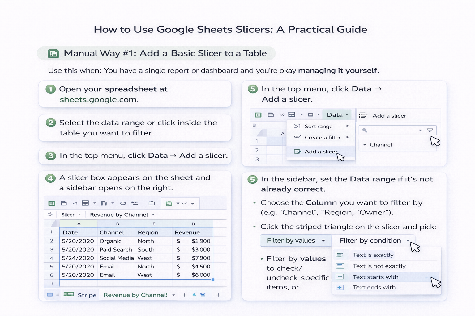
Pros:
Cons:
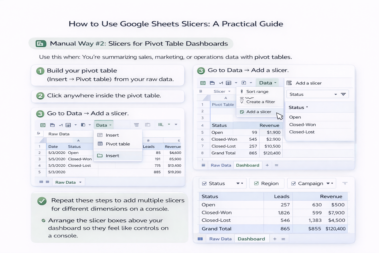
Use this when: You’re summarizing sales, marketing, or operations data with pivot tables.
Steps:
Pros:
Cons:
Use this when: Different stakeholders want different “default” views.
Steps:
Pros:
Cons:
Here’s where your life gets easier.
Simular’s AI computer agents can operate your desktop and browser like a human—opening Google Sheets, adjusting slicers, capturing views, and syncing results into other tools. Instead of you repeating the same clicks across 10 dashboards, an agent replays them reliably.
Example Workflow for a Sales Leader:
Pros:
Cons:
If you’re an agency or distributed team, you probably maintain the same Google Sheets dashboard template for dozens of clients or markets. Manually changing slicers per sheet is where time goes to die.
With a Simular agent, you can:
Pros:
Cons:
Stay manual when:
Use an AI agent when:
Start small: build one clean dashboard, then let a Simular AI computer agent handle the repetitive part—opening Google Sheets, turning those slicers, and delivering the views your business actually runs on.
