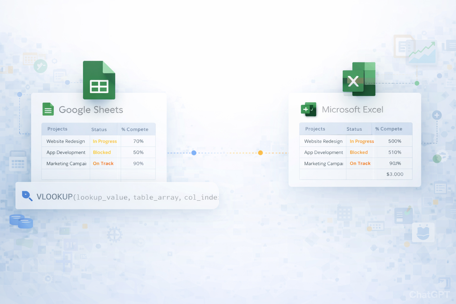
When you’re running more than one campaign, launch, or client project, the real enemy isn’t complexity—it’s fragmentation. Tasks live in Slack, budgets in email, deadlines in someone’s head. A multiple project status report template pulls everything into one view: owners, milestones, risks, and KPIs across every initiative. That single source of truth makes standups faster, executive updates sharper, and prioritization far less emotional. Using a structured template in Google Sheets or Excel also means you can standardize how every team reports, compare projects apples-to-apples, and spot risk trends early instead of reacting late.
Story: imagine your Fridays without copy‑pasting updates. An AI computer agent quietly signs into your tools, pulls the latest metrics, updates each row in your multi‑project tracker, highlights slipping milestones, and even drafts a short summary. You open the sheet, skim the red flags, make two key decisions, and move on. No chasing people, no late-night spreadsheet surgery—just clear project truth, updated for you.
Method 1: Build a basic multi-project grid in Google Sheets
Portfolio Dashboard.Pros: Free, simple, flexible.
Cons: Updates are manual, easy to forget, and error‑prone as you add more projects.
Method 2: One tab per project + one roll‑up tab in Google Sheets
P1_Website, P2_Ads, P3_Product, etc.Portfolio Dashboard tab, use cell references like ='P1_Website'!B2 to pull each project’s status into a central table.=COUNTA(A2:A)=COUNTIF(StatusRange,"Red")Pros: Each PM can own their tab; the dashboard stays read‑only.
Cons: Still manual; references break if people rename tabs or move cells.
Method 3: Use Excel’s project tracker templates
=AVERAGE() or =COUNTIF() to aggregate across sheets.Pros: Professional layouts and charts out of the box.
Cons: Version chaos if people download the file; manual entry remains the bottleneck.
Method 4: Weekly status email collection → Sheets/Excel
Pros: Easy to start culturally.
Cons: 100% manual and the first thing to break when you get busy.
Method 5: Manual dashboard charts
Pros: Great for leadership updates.
Cons: You still rely on humans to keep the data current.
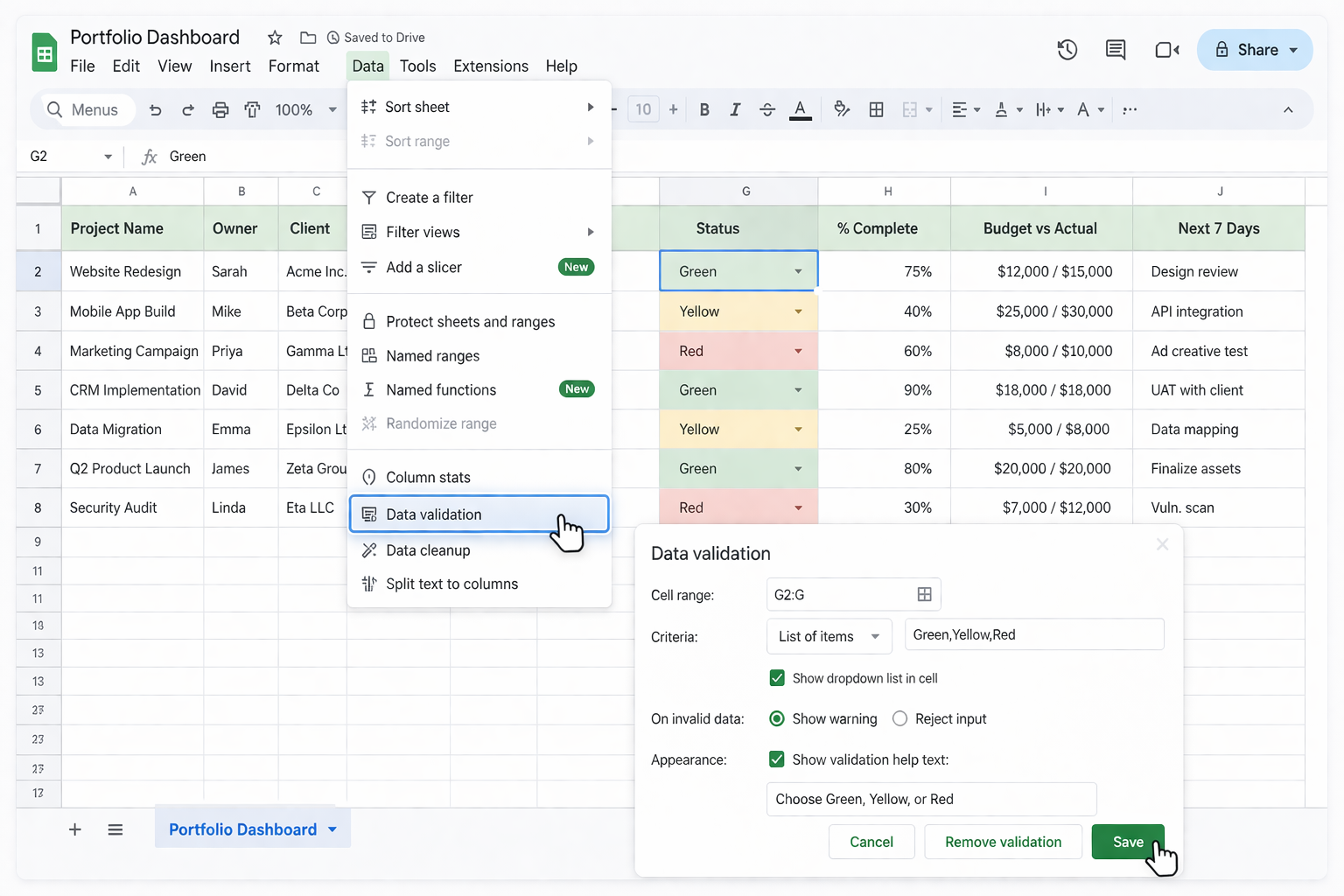
Method 6: Use Google Sheets + Google Forms for standardized inputs
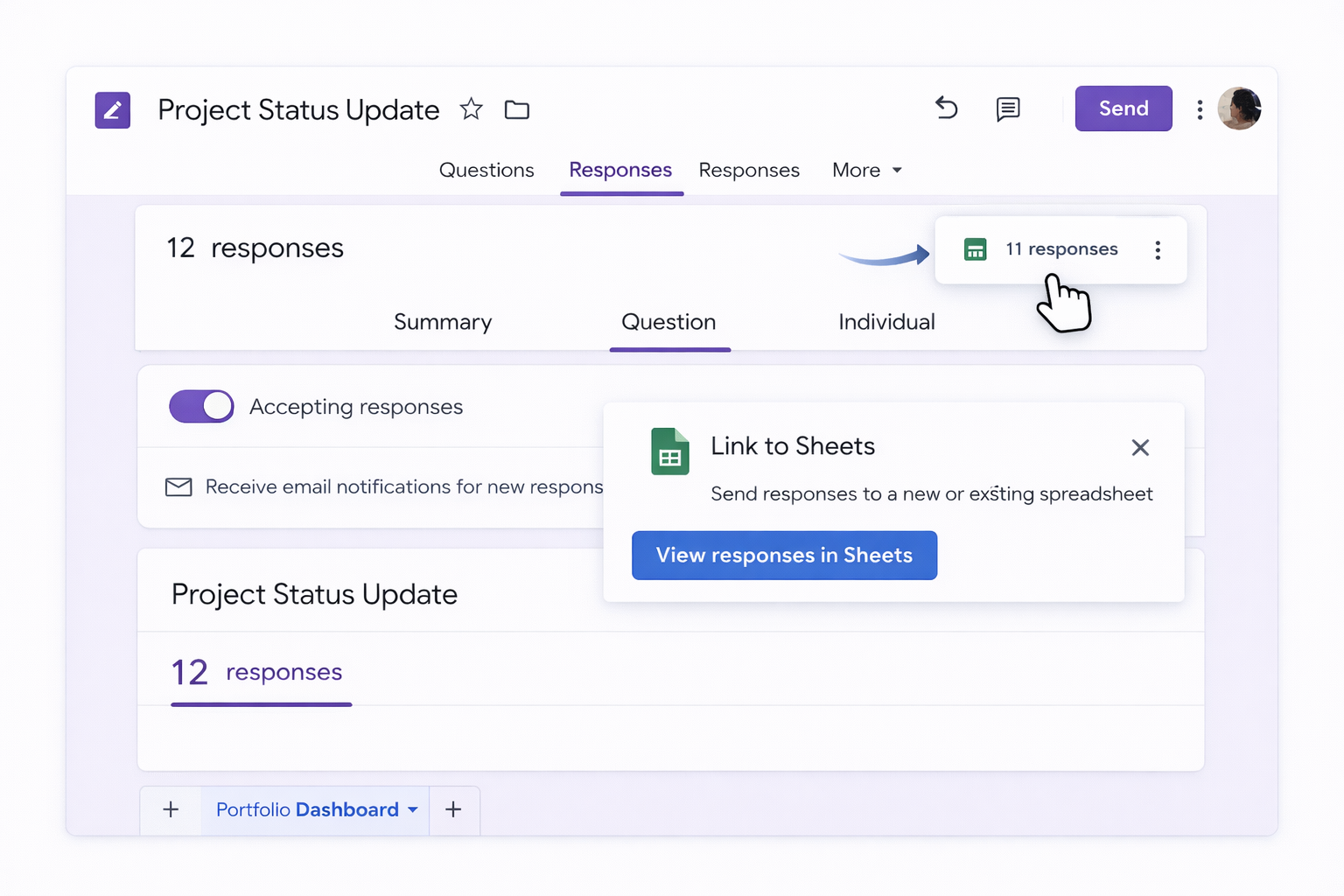
Dashboard with =UNIQUE() to list all projects and =FILTER() or =MAXIFS() formulas to pull the latest response for each.Pros: No one edits the main sheet directly; data is structured.
Cons: Owners must remember to submit; still semi‑manual.
Method 7: Automate inputs with Google Apps Script
Pros: Powerful and free; can automate from many Google sources.
Cons: Requires scripting skills; maintenance burden when layouts change.
Method 8: Use Excel’s templates with Power Query
Pros: Scales well if you’re already a Microsoft shop.
Cons: Owners still maintain their own files; refreshes are manual unless you script them.
Manual and no-code tricks work—until you’re juggling dozens of clients or launches. That’s where an AI computer agent like Simular Pro becomes your operations teammate.
Method 9: Simular agent as your cross-tool updater Story: Every Thursday night, instead of you opening 12 tabs, your Simular agent does it.
Pros: Truly hands‑off updating across desktop, browser, Sheets, and Excel; production‑grade reliability over thousands of steps.
Cons: Requires an initial setup and a short period of observation to tune instructions.
Method 10: Simular agent generating executive summaries
Pros: Leaders get story plus numbers without extra work from you.
Cons: You’ll want a quick human review for tone and key messaging early on.
Method 11: Simular agent as continuous project watchdog
Pros: Early warning system without you staring at dashboards.
Cons: You must keep the rules simple and adjust as your portfolio evolves.
Start by deciding what questions you need to answer in every standup or executive review. Typically, leaders care about: which projects are on/off track, what’s at risk, who owns what, and what’s happening next week. In Google Sheets or Excel, create a single tab called Portfolio or Multi-Project View. Add columns such as: Project Name, Owner, Client, Priority, Stage, Start Date, End Date, Overall Status (G/Y/R), % Complete, Budget vs Actual, Top Risk, Next 7 Days Focus, and Last Updated. Use data validation for status (Green/Yellow/Red) and priority (High/Medium/Low) so entries are consistent. If you have many teams, add a Team or Department column. Freeze the top header row so labels stay visible as you scroll. Once the structure feels right, lock the header row and any formula columns to prevent accidental edits, and share the sheet with edit access only to project owners.
Consistency starts with constraints. In both Google Sheets and Excel, you can use data validation to restrict inputs and prevent free-text chaos. For example, use dropdown lists for Status, Stage, and Priority so everyone speaks the same language. Create a short one-page guide that explains what Green, Yellow, and Red mean in your context (e.g., Red = date or scope at serious risk, Yellow = minor slippage, Green = on track). Share that guide alongside the template. Next, standardize the cadence: pick a specific day and time each week when owners must update their row. To enforce this, you can use Google Forms feeding your sheet, or a simple Slack reminder linking to the tracker. Finally, appoint a portfolio owner who reviews changes weekly, cleans up formatting, and follows up on missing or inconsistent entries. Over a few cycles, this cultural habit becomes self-sustaining.
Once your Google Sheets or Excel template has clean, structured data, you can turn it into visuals that leaders can scan in seconds. In Sheets, select your Status column and Project Name column, then use Insert → Chart to build a bar chart that counts projects by status color. Add another chart that shows projects by stage or by team to highlight where capacity is stretched. For timelines, create a Gantt-style chart by using start and duration columns and a stacked bar chart. In Excel, PivotTables are powerful: insert a PivotTable summarizing projects by Status and Team, then insert PivotCharts for a dynamic dashboard. Keep the visuals minimal: 2–4 charts that answer "How many? Where is the risk? What’s late?" If leadership prefers slides, you can copy these charts into PowerPoint or Google Slides and refresh them directly from the source docs before each meeting.
A common pattern is one tab per project plus a single summary tab. In each project tab, define fixed cells for the key fields you need in your roll-up: for example, B2 = Project Name, B3 = Owner, B4 = Status, B5 = % Complete, B6 = Risk, B7 = Next 7 Days. In your summary tab, create a table with matching columns. For each project row, use formulas that reference those fixed cells, like =P1_Website!B4 for status. To avoid hard-coding many sheet names, you can keep a list of project tab names in a helper column, then use INDIRECT in Sheets or Excel (e.g., =INDIRECT("'" & A2 & "'!B4")) to dynamically pull values. Be cautious though: INDIRECT is volatile and can slow large workbooks. For bigger portfolios, consider using QUERY (Sheets) or Power Query (Excel) to combine ranges from each tab into a single normalized table, then build your summary and charts on top of that combined data.
First, stabilize your template: make sure your Google Sheets or Excel multi-project status layout won’t change every week. AI agents work best when cell locations and workflows are predictable. Second, document your current manual steps in detail: which tools you open, what metrics you read, which columns you update, and in what order. This becomes the blueprint for your AI computer agent. With a platform like Simular Pro, you then record or describe these actions so the agent can replicate them across desktop, browser, Sheets, and Excel. Start with a small subset of projects and run the agent in a supervised mode, reviewing each run via its transparent execution logs. Fix edge cases (e.g., missing data, login issues) and refine prompts until it’s reliable. Once you’re confident, schedule it via webhook or your existing pipeline. At that point, your role shifts from "spreadsheet updater" to "portfolio strategist"—you spend time reading the insights instead of typing them.